

Designing the first visuals for an AI-powered foundation matching app.
AI-powered
Freelance
Ringo AI brought me on as a freelance product designer to design the first visual prototype for mySkin; an application that uses proprietary AI to scan a user's skin tone and recommend the most accurate foundation match. From flow to hi-fi, I owned the entire design journey.
The Client
"We don't guess, we know skin"
Ringo AI are innovators who transform cameras into precision measurement tools, the global leader in mobile skin imaging and analysis. They're the first to enable smartphones to measure color and material properties without additional hardware, delivering accurate, consistent data on skin tones and condition across e-commerce and mobile platforms.
Business Goals of Ringo AI:
Transform the way cameras see the world to deliver better data, better AI, and better outcomes.
Empower consumers and commercial partners with high-value data, apps, SDKs, and AI services.
Enhance the ability of cameras and AI algorithms to serve people of color equitably.
Challenge
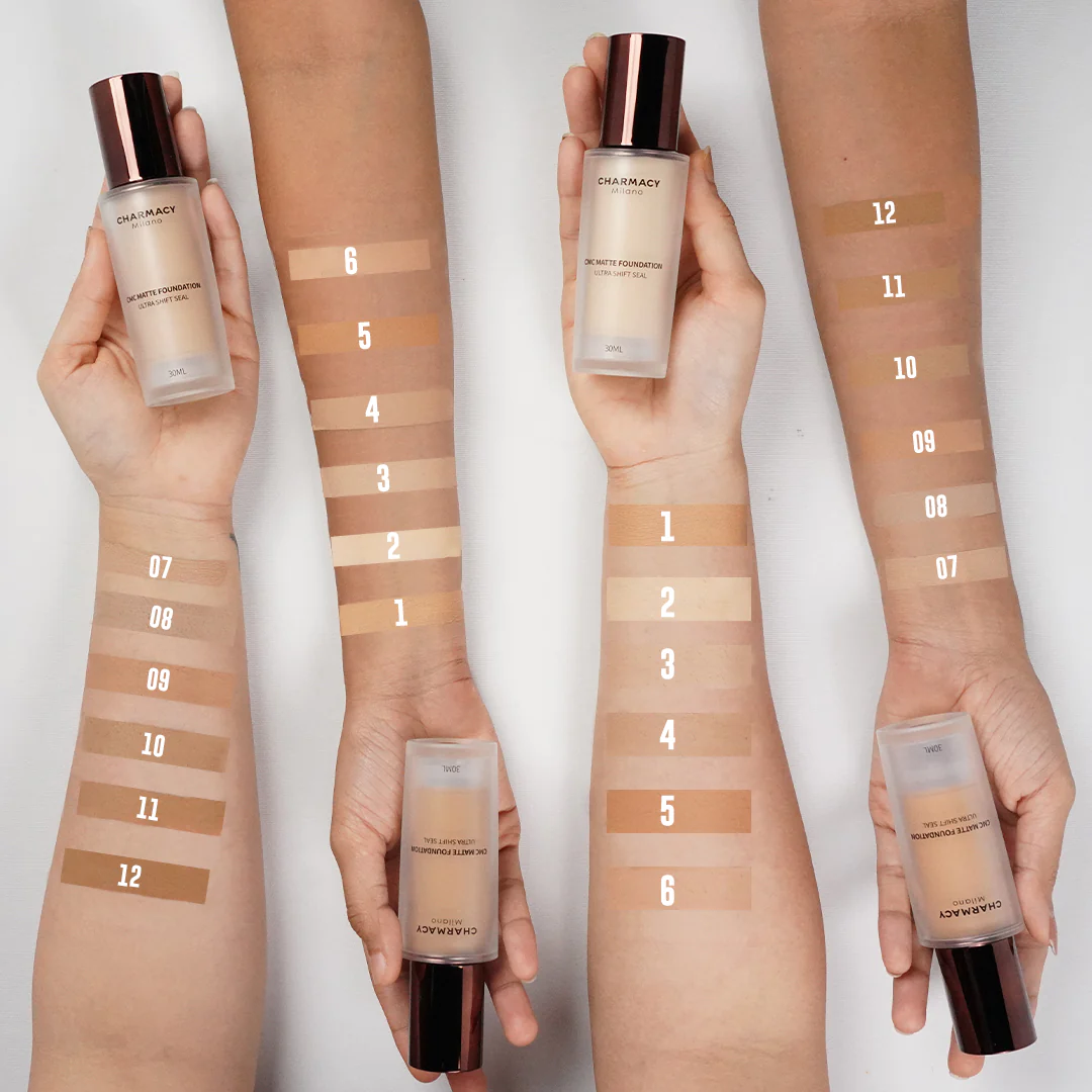
Around 50% of all makeup users struggle to find the right shade of the foundation for their skin!
Finding the perfect foundation shade for your skin can be a daunting task. With so many options available, it's easy to get overwhelmed and end up with a shade that doesn't match your skin tone or undertone. This is because every person's skin tone is unique and finding a foundation that matches perfectly can be a difficult task.
Nearly Nine in Ten Women Would Try a Hand Held Device Which Guarantees to Find Their Perfect Foundation Match
— Insight Hub, Ipsos.com
Objectives
What the product needed to achieve.

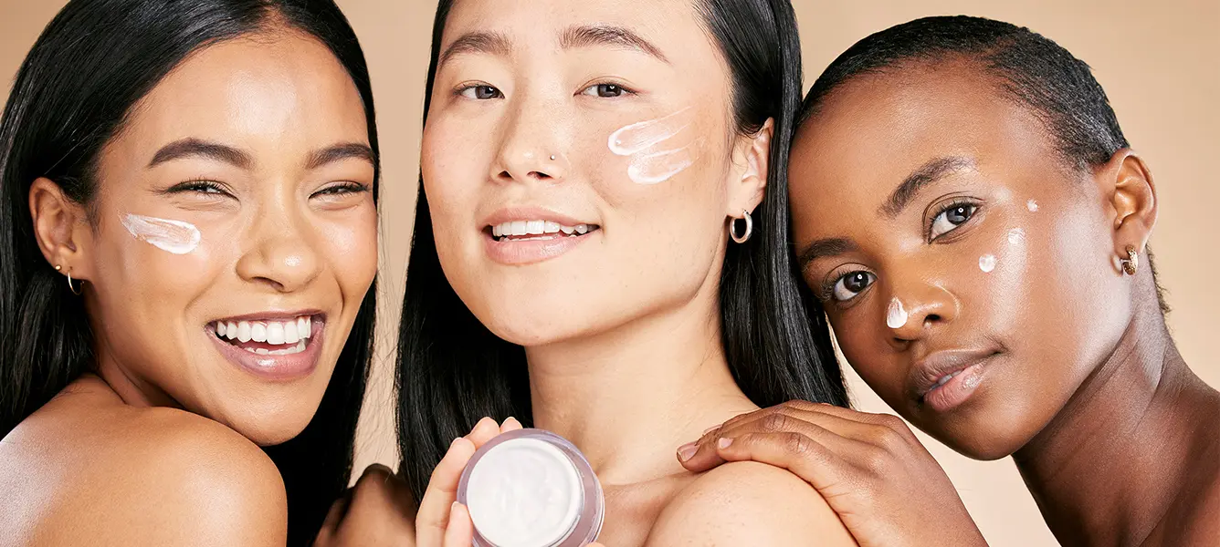
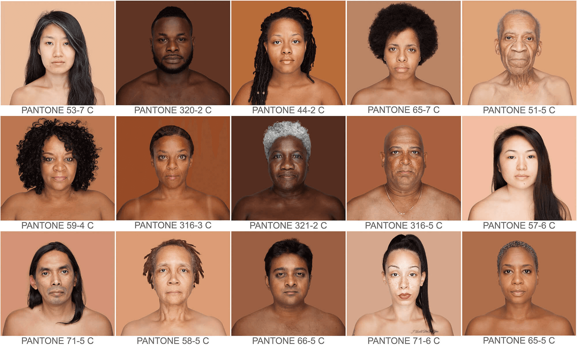
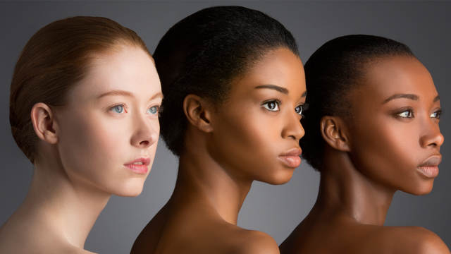
Caters to a diverse range of skin tones!
It should be inclusive and consider the unique needs of users with different ethnic backgrounds, ensuring that everyone can find their perfect match.

Intuitive and user-friendly interface!
Allow users to easily navigate the app, understand the instructions for the face scan, and receive their shade recommendations effortlessly.

Eliminate the guesswork and provide precise color matches!
Accurately analyze a user's skin tone using AI and recommend the most suitable foundation shades; no ambiguity, no close-enough.

Feedback mechanism to collect user opinions and experiences!
This can help in continuous improvement and refinement of the shade matching algorithms and overall user experience.
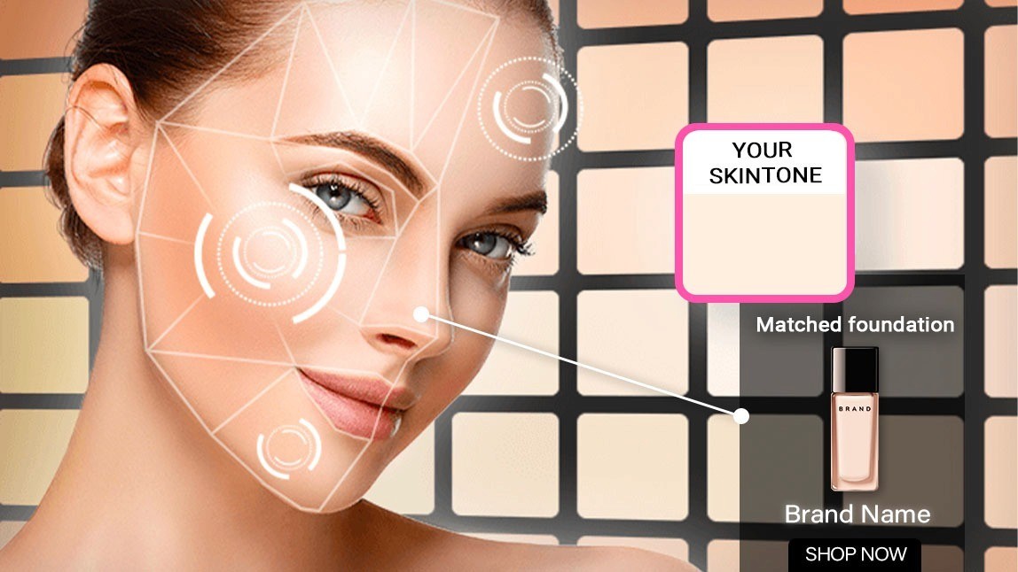
Understanding the Technology
How mySkin's AI works.
01
Measure skin reflectivity
The phone camera captures and measures light reflectivity properties of the user's skin in real time.
02
Measure foundation reflectivity
The same measurement is applied to a database of foundation shades across brands.
03
AI compares the two
mySkin's proprietary AI cross-references both datasets to find the closest match.
04
Present the best match
The foundation product with the best match is recommended with a buy link.
Onwards to design
Mapping the User Flow
I started by mapping the primary path a user takes to complete the core objective: getting a foundation recommendation. The flow needed to handle onboarding, scan instructions, the scan itself, and results presentation without unnecessary detours.

Building the Style Guide
I established a cohesive visual language, brand colors, greyscale, logo dimensions, then built a small design system referencing Google's Material Design guidelines for Android consistency.


Wireframing the Screens
With the flow and visual system locked, I moved to low-fidelity wireframes testing layout logic. Where does the camera preview live? How are instructions layered? What is the results screen hierarchy?

Hi-Fi Prototype
Introducing mySkin — enabling you to confidently buy the right foundation, online.
Splash Screen & Login / Signup

Design with Inclusivity in mind:
Every touchpoint involving skin representation: onboarding illustrations, scan overlays, recommendation cards was designed with a diverse range of tones.
Home & Registration Flow

Instructions — Version 1 & Version 2

Making the scan feel trustworthy:
I designed two versions of the instruction screens: one with text based instructions + photographs, one with visuals for instructions, iterating toward a version that set clear expectations on lighting, positioning, and timing before the camera opened. Transparency to reduce anxiety.
Scanning Progress — Version 1 & Version 2

Showing progress with visible data:
I created two scanning progress screen versions with micro-copy communicating live instructions to better guide the user for a successful scan.
Foundation Recommendation & Rating

Outcome & Reflections
From brief to hi-fi
I delivered: End-to-end hi-fi prototype covering the full primary journey, Android design system built on Material Design guidelines, Defined color palette, logo system, grid, and typography, Two iterated versions of scan instructions and progress screens, Foundation recommendation screen with rating & feedback loop.
Key Learnings 01
Understand the technology before designing for it
Designing a UI for an AI product means the technology is part of your UX. I had to understand what the AI was doing at each step before deciding how to communicate or elegantly hide it from the user.
Key Learnings 02
Iteration matters most at moments of highest friction
Scan instruction and progress screens were the most iterated parts because that's where users are most uncertain. Explaining the "why" always outperforms just showing the "how."
Key Learnings 03
Inclusivity has to be designed, not assumed
A product promising to work for all skin tones must visually represent all skin tones. I actively questioned every image and illustration for representation bias and it made the product better.

